Who We Are
InfoTrust is a close-knit group of developers, engineers, analysts, and visionaries.
Learn More

InfoTrust is now certified to resell the complete Google Marketing Platform enterprise stack, solidifying its status as a full-stack GMP Sales Partner. CINCINNATI —…
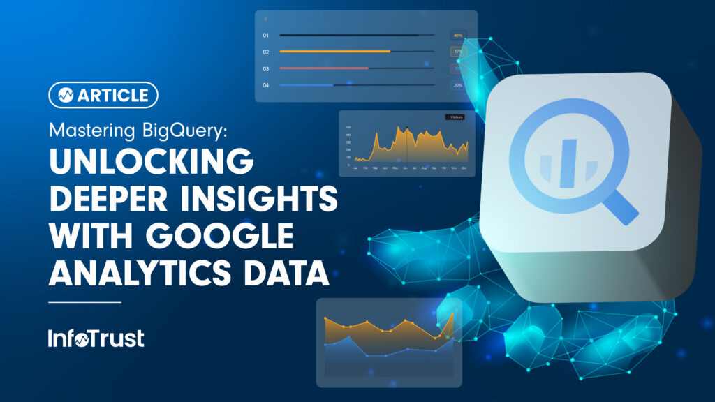
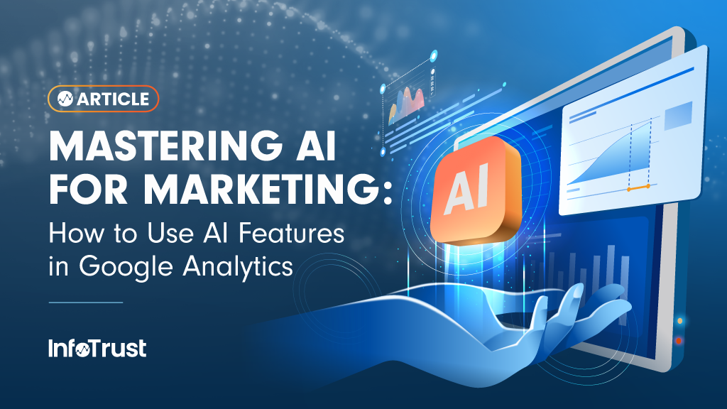
Google Analytics (GA) provides valuable insights into user behavior, but its standard interface often presents limitations when you need to perform truly advanced analysis,…

At InfoTrust, we consistently get questions about buying ads on YouTube TV. It seems as if the world knows you can do it in…
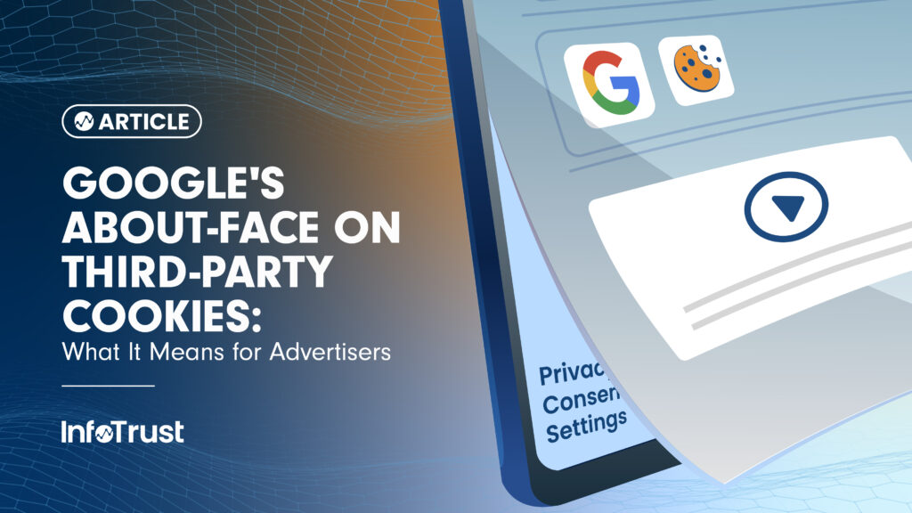
Google’s prolonged journey towards phasing out third-party cookies in its Chrome browser took another significant turn. Recently, Anthony Chavez, VP of Google’s Privacy Sandbox,…
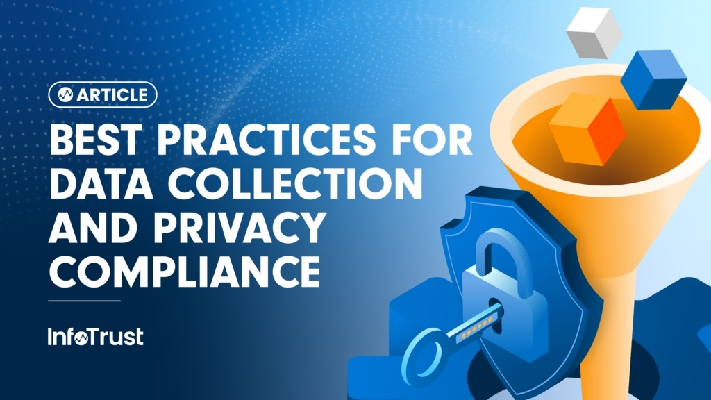
In today’s data-driven world, effective data collection is essential for understanding customer behavior, optimizing marketing strategies, and driving business growth. However, with increasing privacy…

Today we announced that the InfoTrust Foundation has reached $1M in lifetime contributions, supporting organizations around the world that are saving lives and building…

As AI revolutionizes digital marketing, the traditional media agency model faces an existential threat. AI-driven tools now allow advertisers to automate media buying, optimize…
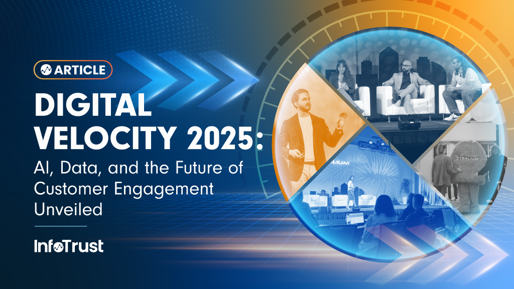
From March 3-5, 2025, I had the privilege of attending Tealium’s Digital Velocity 2025: AI & Data on the Digital Frontier event in San…
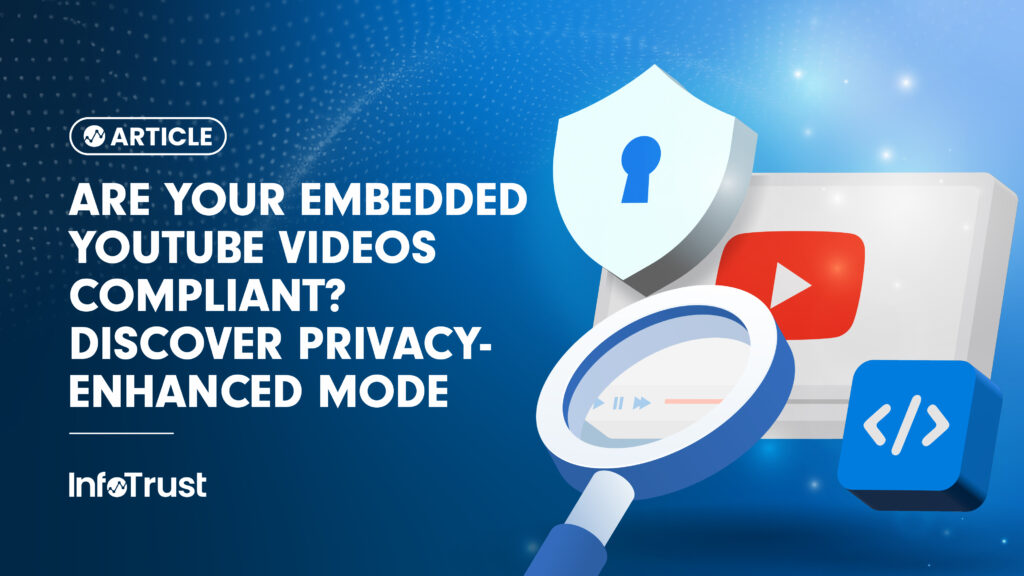
Important Disclaimer: We are not legal professionals. The information provided here is for educational purposes only and should not be considered legal advice. It’s essential…

Global advertisers know the drill: a meticulous paid search audit is crucial. But an audit alone doesn’t guarantee performance. The real challenge? Ensuring those…

Meta has recently released a partner integration for Google Analytics (GA). Via this integration, advertisers are able to pull reporting data from GA directly…
The digital marketing landscape is in a state of constant, rapid evolution, demanding more than just raw data—it requires actionable intelligence. As attaining these…
Notifications